Advent Calendar — Creation and Configuration
Create excitement and engagement with an Advent Calendar campaign that unlocks content day by day. This versatile format can be used for timed promotions, daily streak challenges, countdown events, or traditional advent calendars—all designed to keep your audience coming back for more.
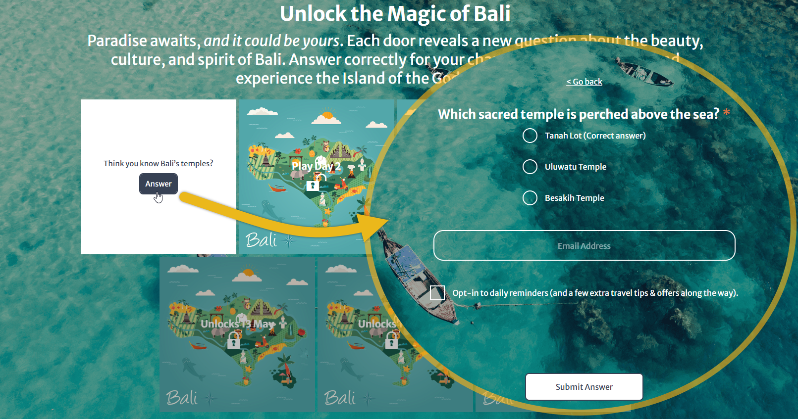
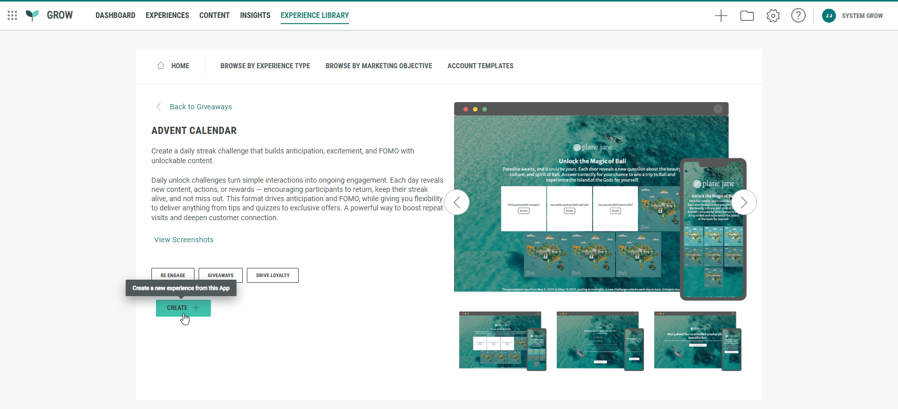
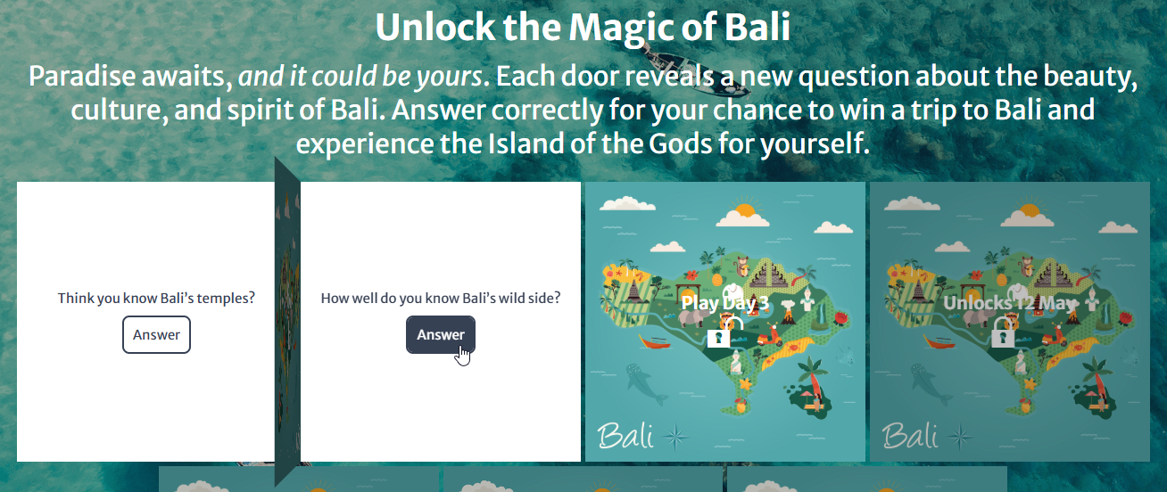
Example Advent Calendar:
These are the steps to do when setting up an Advent Calendar:
- Create an Advent Calendar Experience
- Set up Promotions
- Customize the Experience
- Test the Experience
- Publish the Experience
Create an Advent Calendar Experience
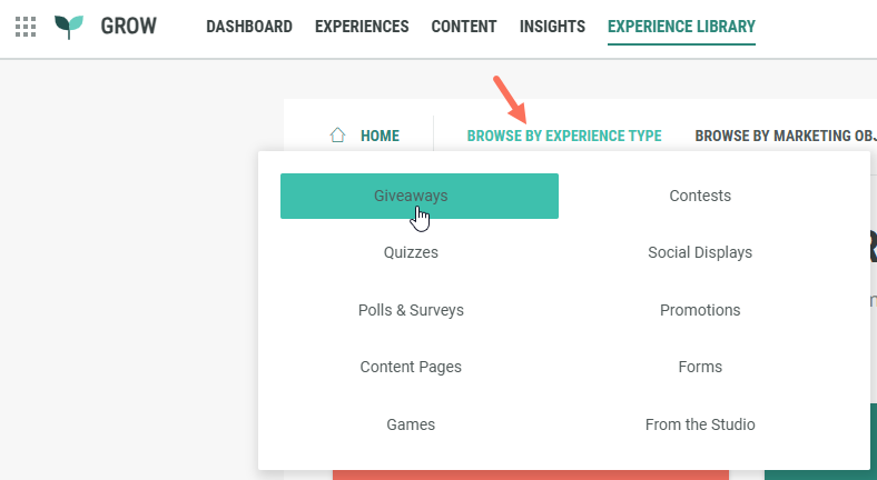
- Navigate to the Experience Library in the Top Navigation bar.
- Click on Browse by Experience Type, and select Giveaways.
- Select the Advent Calendar Experience.
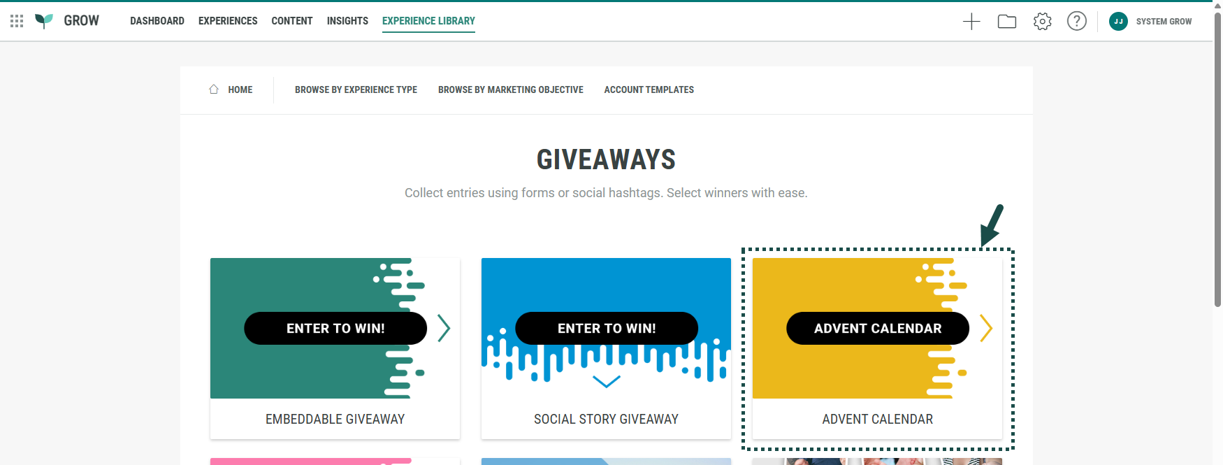
- Click Create +.
- A wizard takes you through the Experience creation process.
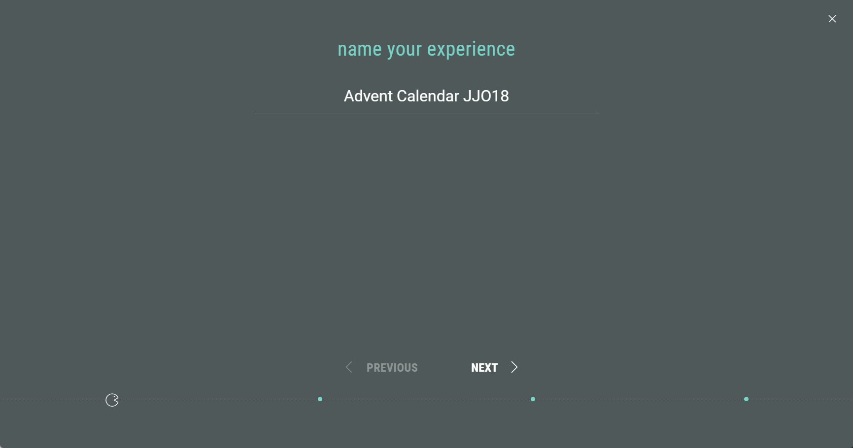
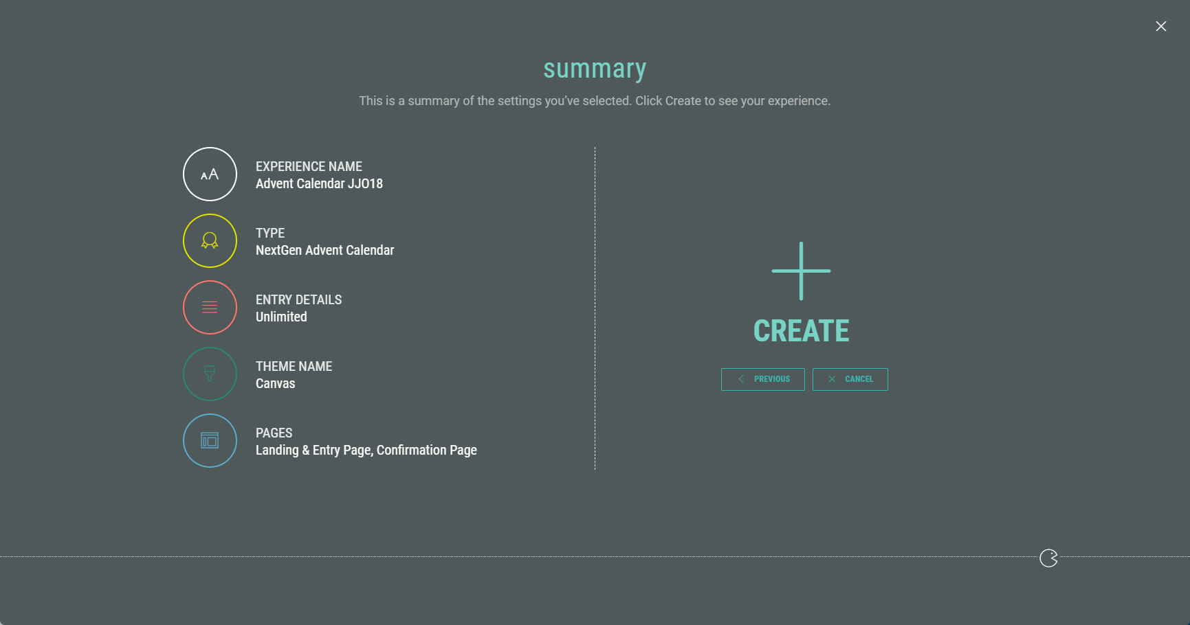
First of all, name your Experience, then click Next.
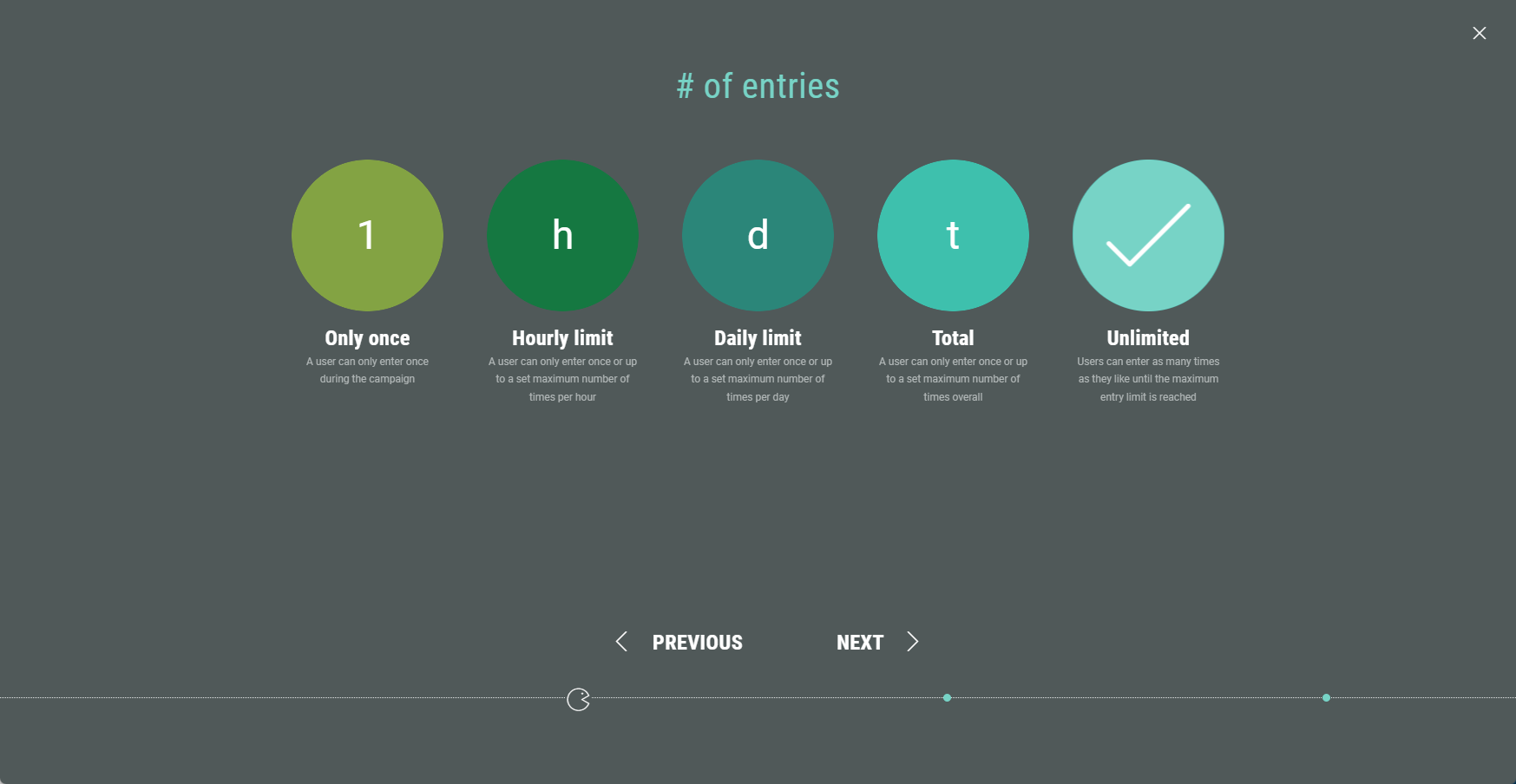
- Select the number of entries, then click Next.
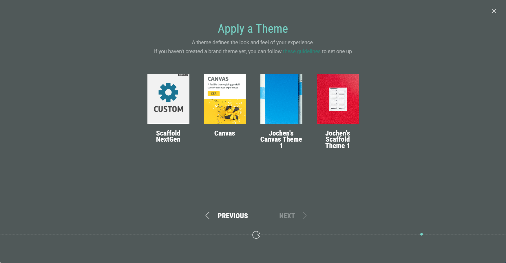
- Choose a theme. You can select one of our foundation themes (Canvas or Scaffold) or your brand theme if your account has one (or more) configured. The theme determines the look and feel of your Experience. Then click Next.
- Finally, you're presented with an overview of the Experience setup so far. If you’re happy, click Create to finalize your settings and create the Experience.
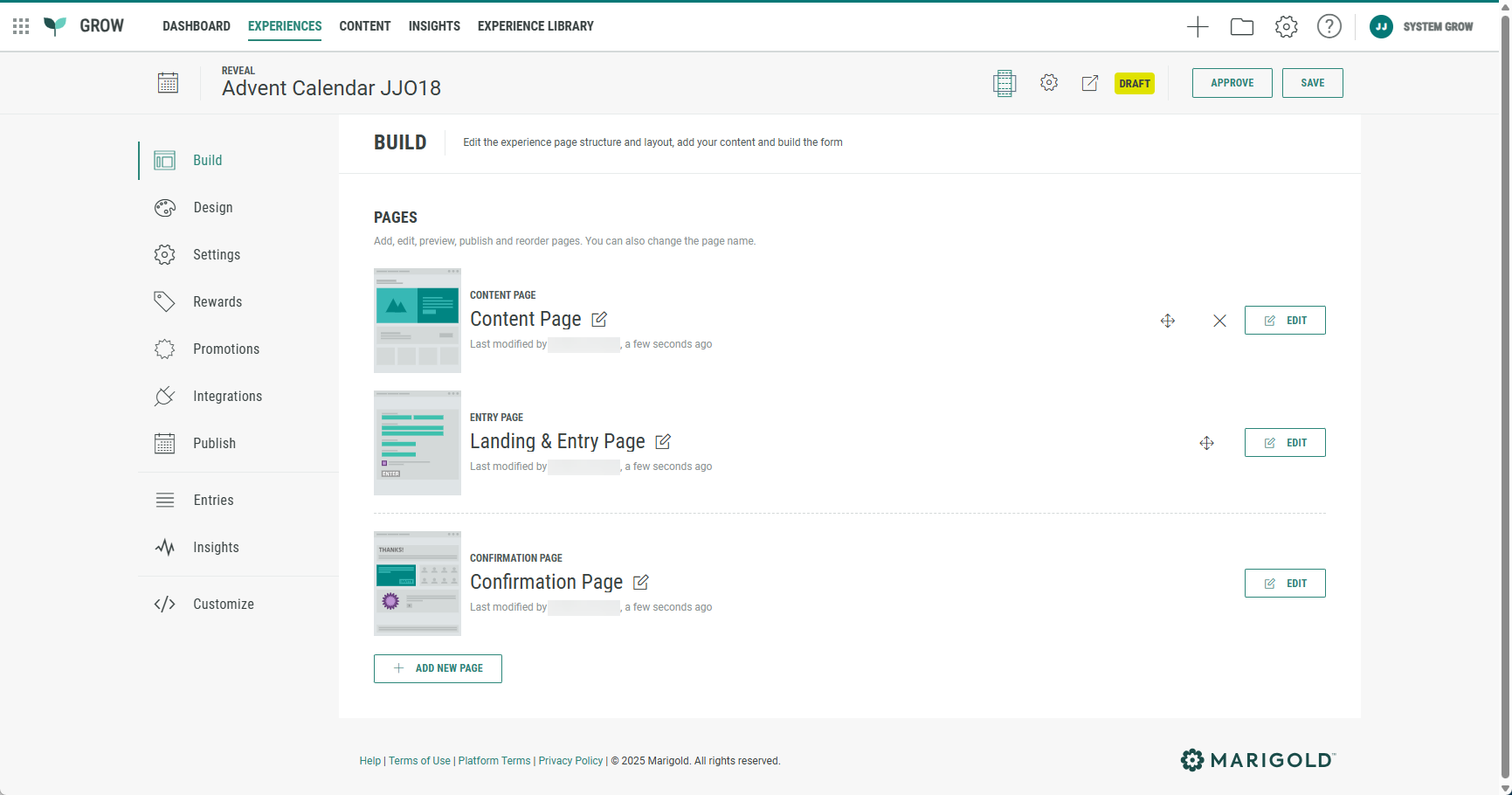
- Once you have completed all the steps in the wizard, you land back in your Experience area. Here you find several tabs to work through in order to build, design, and publish your Experience.
Set up Promotions
The next step is to set up Promotions, which are clickable doors in the Experience, and the key to every successful Advent Calendar campaign. See this article on how to configure Promotions.
Customize the Experience
Once you have created the Advent Calendar Experience and set up the Promotions, it's time to customize the Experience by building and designing exactly what you want your visitors to see.
Build tab
The Build tab provides an overview of all pages included in your Advent Calendar.
By default, it contains three pages:
- Content Page
- Landing & Entry Page
- Confirmation Page
Each page can be customized.
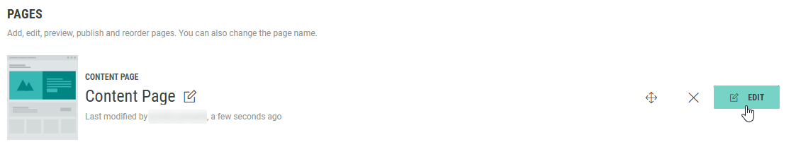
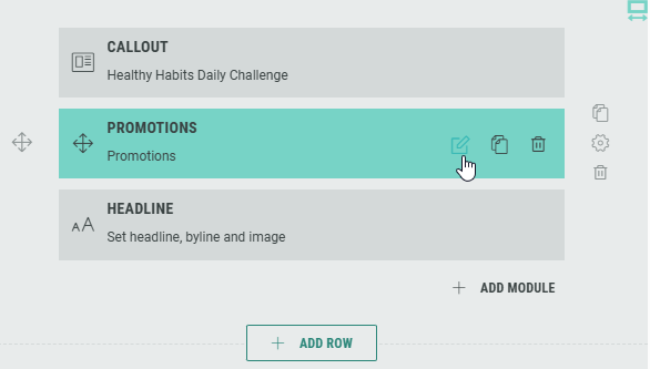
Content Page
Click Edit next to Content Page to enter the Page Builder.
By default, three modules are included:
- Callout — Add supporting text or images.
- Promotions — Displays the clickable doors.
- Headline — Introduces your calendar or campaign message.
You can add, edit, or remove modules as needed.
Configure the Promotions module
The Promotions module controls how your doors (promotions) appear and behave.
To configure promotions:
- Click the pencil icon on the Promotions module.
- On the Settings tab, under Content, configure the maximum number of promotions to display. These are the clickable doors in the Advent Calendar. The number of items should be at least 1 and maximum 100.
Example: You could have configured 40 promotions, but only want to display 11 at any given time.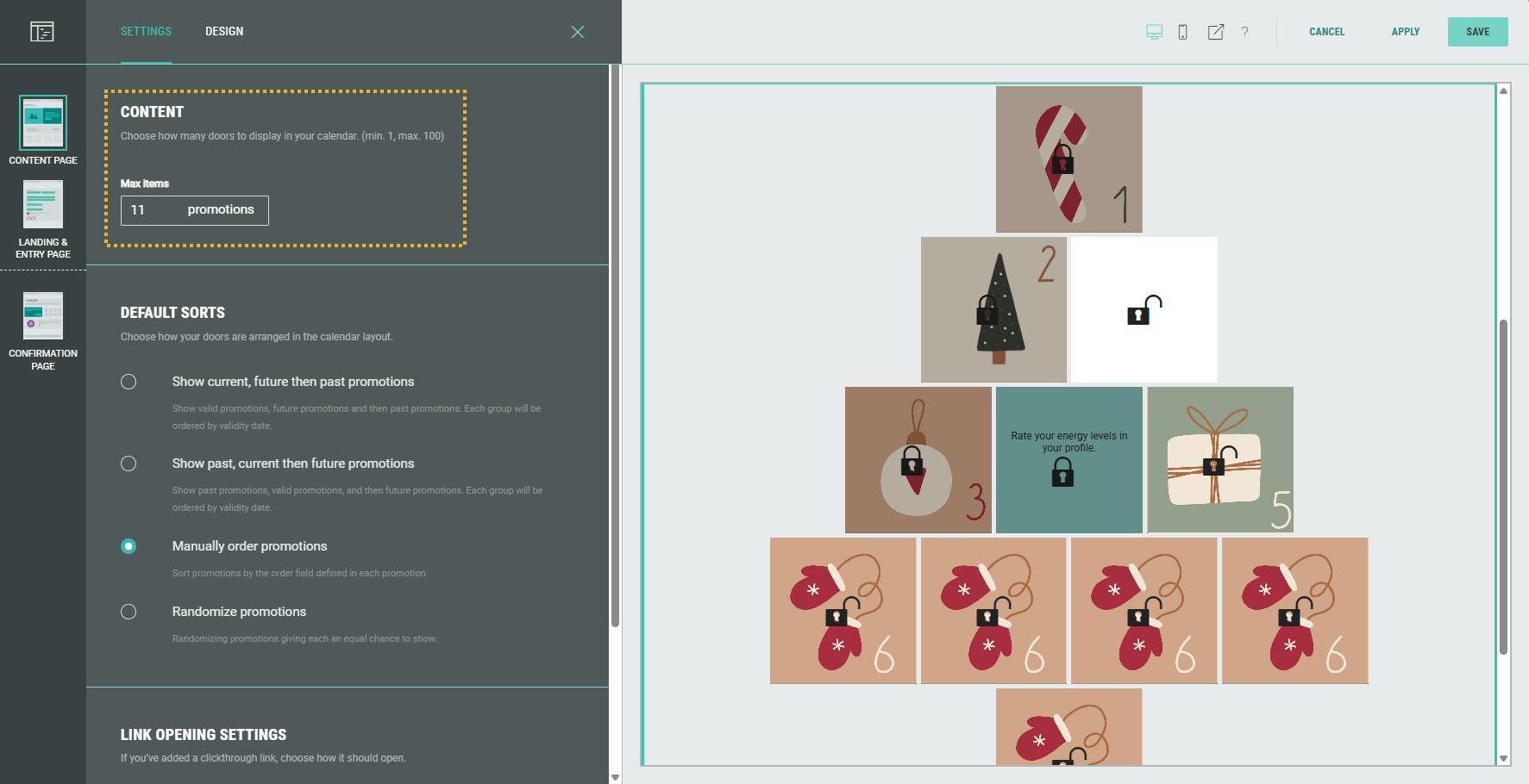
Note: The opened/closed lock on each door is based on the valid from/to dates, to show if it's a clickable door or not.
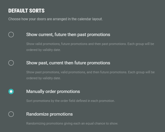
- Show current, future then past promotions — Shows active promotions first, then promotions active in the future, and finally expired promotions. (Based on the valid from and valid to dates in the promotion settings.)
- Show past, current then future promotions — Shows expired promotions first, then active promotions, and finally promotions active in the future. (Based on the valid from and valid to dates in the promotion settings.)
- Manually order promotions — Follows the order numberset in each promotion.
- Randomize promotions — Displays promotions in random order for every visitor. All the promotions have an equal weight of being shown. The order is stored per session, so the same visitor will always see the exact same order unless they clear their cookies/session storage.
- For click-through links (when a CTA is added, linked to a Details Page or external URL), you can choose how they should open: In a new window, in the parent window, or within the same frame.
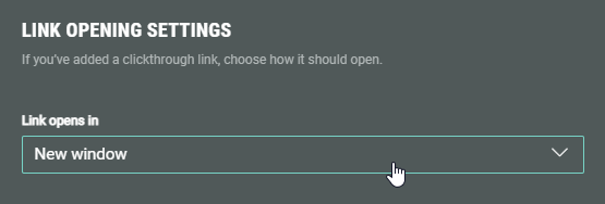
Note:
- Same frame = The link opens right where the visitor is — it replaces the content in that specific area (or tab). This is what happens most of the time when you just click a regular link.
- Parent window = This is used when the link is inside something embedded, like a pop-up, iframe, or mini-page that’s part of a larger site. Instead of opening inside that smaller section, it replaces the main page behind it.
Promotion module design
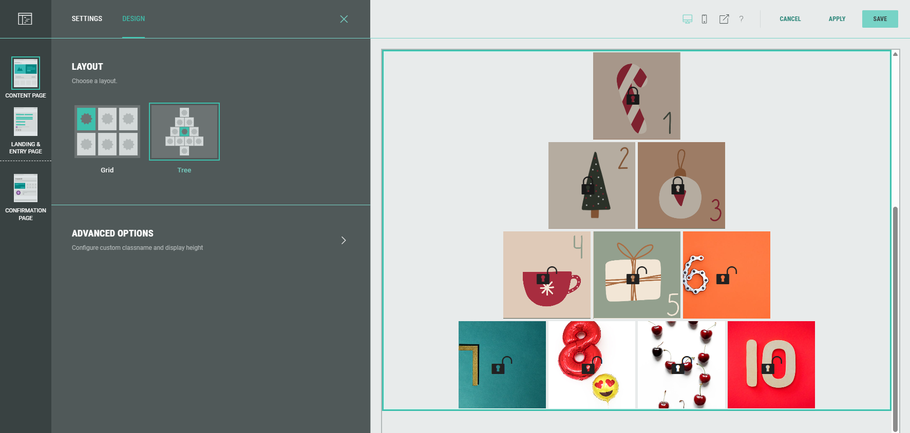
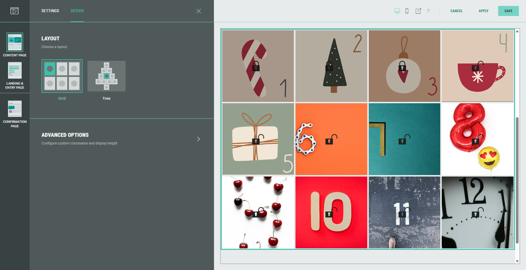
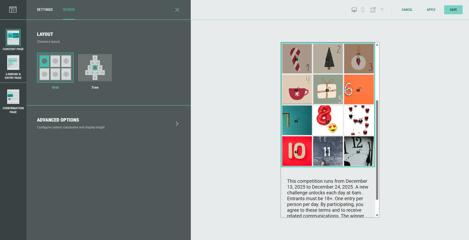
- On the Design tab, select the layout of the promotions. The preview on the right displays the selected layout.
- Tree layout:
- Grid layout on desktop (4 promotions per row):
- Grid layout on mobile (3 promotions per row):
- With the advanced options, you can configure the display height of the Promotions and set a custom class name.
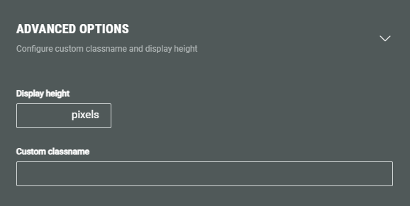
- Display height — Defines the fixed pixel height for this module.
Note: This overrides any heights set in the theme or stylesheet.
- Custom classname — Will be output as xCustomModule-[Your-CSS-Classname] in the module when it is rendered on the page. Use this to give your module a unique style. You can also target CSS classes in a theme using the custom CSS classname.
Warning: Only touch this section if you are a developer, as this may impact your Experience hugely.
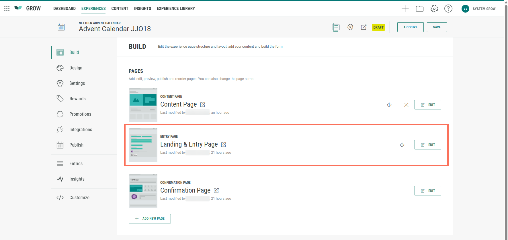
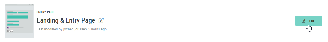
Landing & Entry Page
You can use the Landing & Entry Page to capture data from the Experience entrants.
- Click on the Edit button at the right of the Landing & Entry Page to enter the Page Builder.
- The Landing & Entry Page contains a Form section with some form elements by default, such as an Email address input field and an Opt-in selection checkbox.
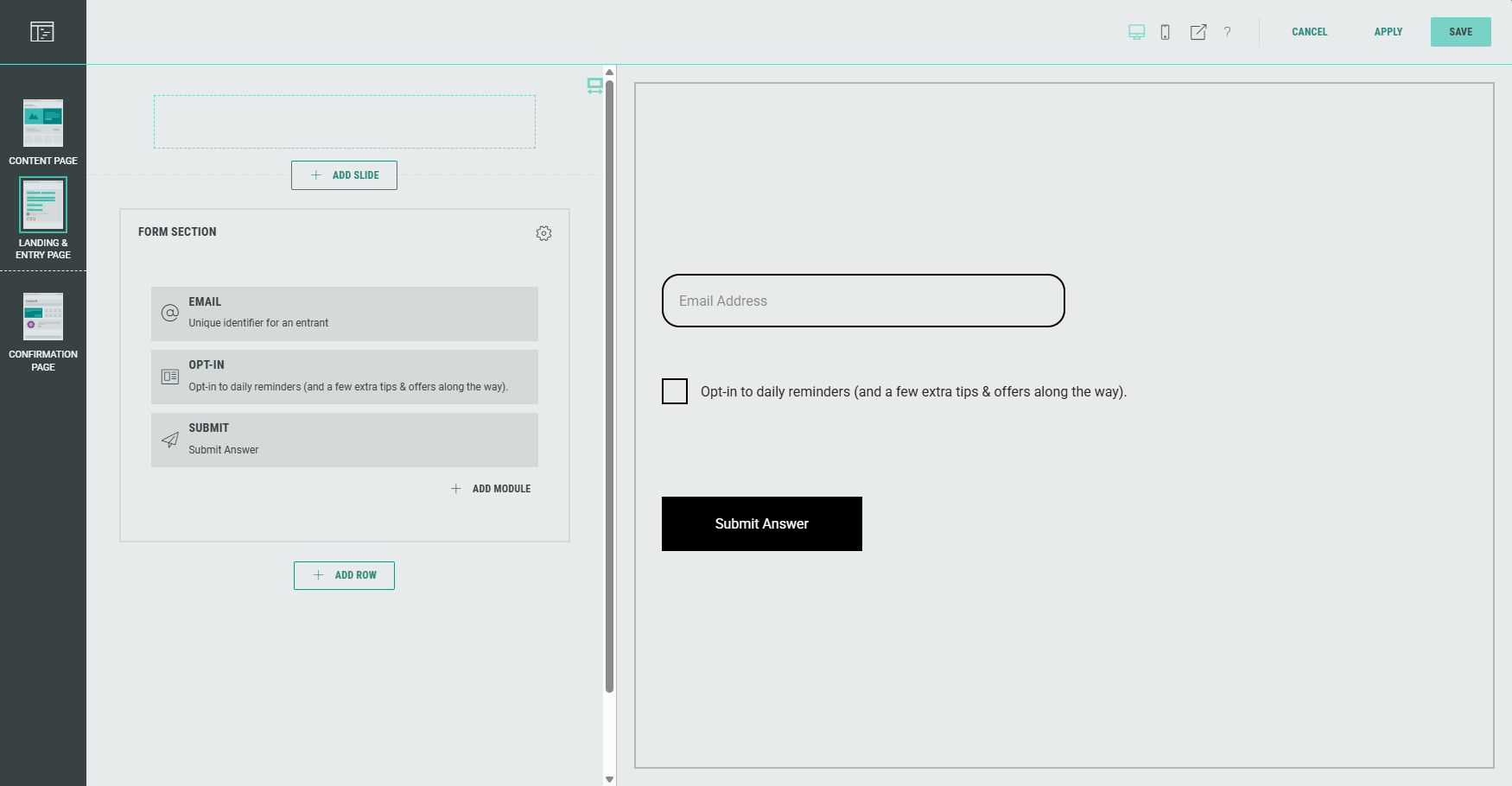
Note: Hovering over any of the elements on the left with the mouse cursor will auto-scroll and highlight the corresponding element in the preview on the right, and vice versa.
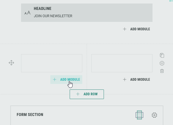
- You can add rows by clicking on the + Add Row button (that appears underneath each existing row section).
- You can add modules by clicking on the + Add Module button that appears in each row (and in each column for a multi-column row layout).
Note: You can add, edit and delete modules, and customize each module for your Experience.
Form modules can only be added in the Form Section.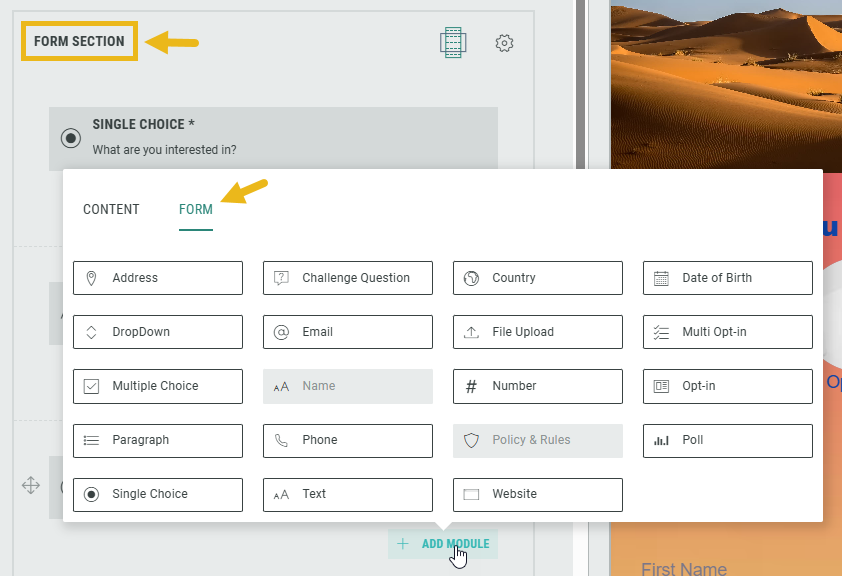
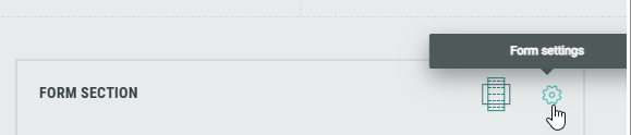
- Within the Form Section you can click on the Gear icon to access the Form Settings.
In the Form Settings, you have the ability to customize the form such as adding a background image and color, and changing the field style. Consult this topic for more info on the Form Section.
Note: On the Advanced tab in the Form Settings, you can define a Customer ID for linking data collection to the correct user profile. More info on this subject can be found here.
- Now let's configure the default Form Section modules.
Note: You can add and configure additional modules as desired, and delete modules you don't need.
Configure default Form Section modules
Email module
The Email module will ask the Experience entrants to enter their email address in an input field.
- Add a label and determine whether or not the field must be completed by participants.
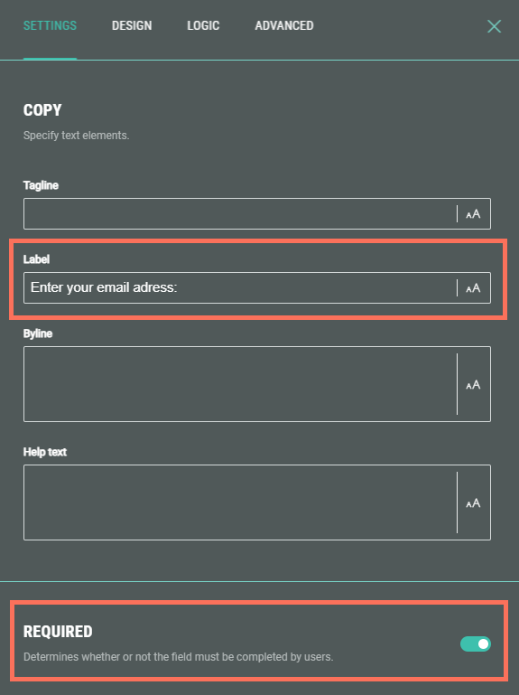
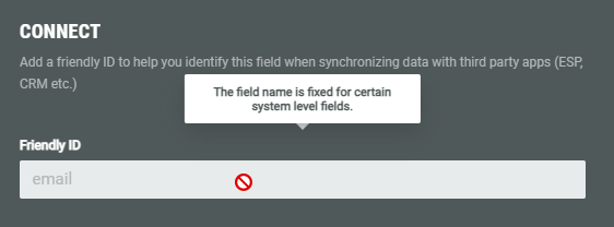
- The Friendly ID is fixed (read-only) for this field.
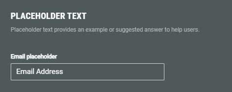
- Set the placeholder text for the email field.
- Additionally, as for other modules, you can configure the design of the field, define any conditional logic (when applicable), and set advanced error messages for when the input is invalid or when the field is left empty.
Example: Preview of the email address field with placeholder text.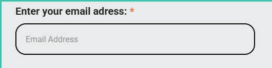
Opt-in module
See the Opt-in module section in this article on how to configure it.
Submit module
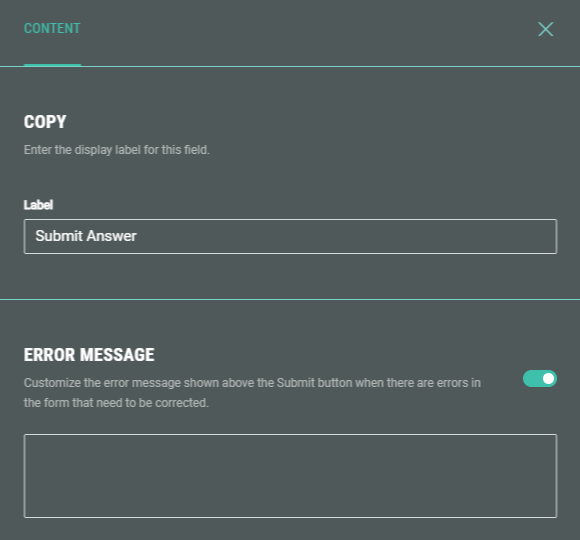
The Submit module is needed to confirm and send the completed form. It appears as a button in the Experience.
Enter a button label, and if desired, customize the error message that appears when the form contains errors and can't be submitted.
Confirmation Page
Below the Landing & Entry Page, you can see the Confirmation Page.
The Confirmation Page is the final page of the Experience. Typically, this page is used to show a thank you message or a reward to entrants once they have completed the form. It's displayed as soon as they hit the form submit button.
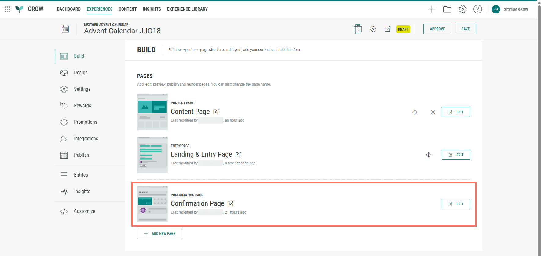
- From the ExperienceBuild tab, click on the Edit button at the right of the Confirmation Page to enter the Page Builder.
Note: When you're already inside the Page Builder, you can switch between pages on the left.
Click on the Confirmation Page to edit it.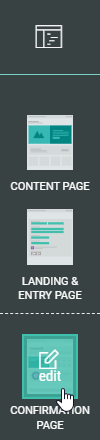
- The Confirmation Page already contains a Callout field.
You can edit, copy, or delete it.
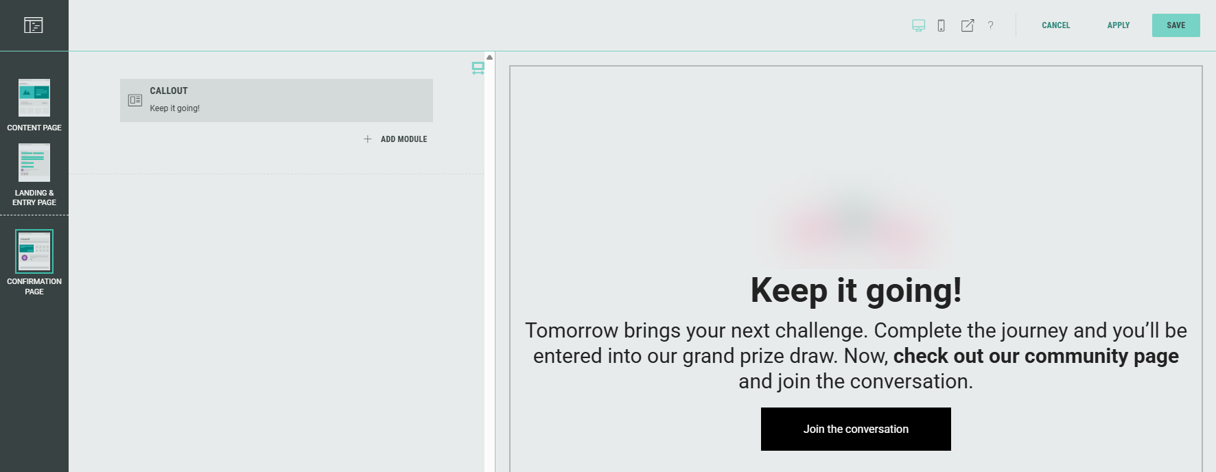
- As with the Landing & Entry Page, you can add, edit, and delete rows and modules to customize your Experience.
Note: Don't forget to save your changes (see Page Builder actions here).
Design tab
The Design tab can be found directly below the Build tab. Here, you can continue to customize your Experience with the Display Type (Page- or Slide-based), change or edit the Theme, and add a footer and background in the Page Structure and Design section.
Note: Read about Design tab details in this article.
Settings tab
On the Settings tab, you define and edit some key settings for your Experience, to control entries etc.
Note: You can find more detailed info about the Settings tab here.
Rewards tab
A Reward is an incentive offered to customers for participating in a Grow Experience, with the ultimate goal of learning something new about that customer or driving engagement with your brand. Rewards, like prizes, offers, or coupons, can be provided in real-time and have been shown to boost overall engagement. They can be structured as everyone wins or with set odds with consolation rewards as an option. Inclusion of a reward in your experience will boost participation.
Note: Learn more on how to add Rewards to an Experience and display Rewards to Experience entrants.
Test the Experience
To try out the Experience, click the Staging URL icon in the top bar.
You can click the Advent Calendar cards (promotions) to open the doors and see what's behind them, and click configured CTA buttons, such as those that lead to an answer/opt-in form.
Note: After you test the Experience, any opened doors remain open when you access the Staging URL again.
To reset the Experience, add &debug=1 to the end of the URL in your browser's address bar. The doors will then close again.
Publish the Experience
Once you're happy with the setup of your Experience, you can move on to the Publish step.
We offer 3 ways to publish your Experience.
You can either embed it on your website, host it within a pop-up, or publish as a landing page.
Note: Here you can read more about the publish options to make sure you pick the right one for your business needs.
After publication, the Experience is live and accessible for your audience.